
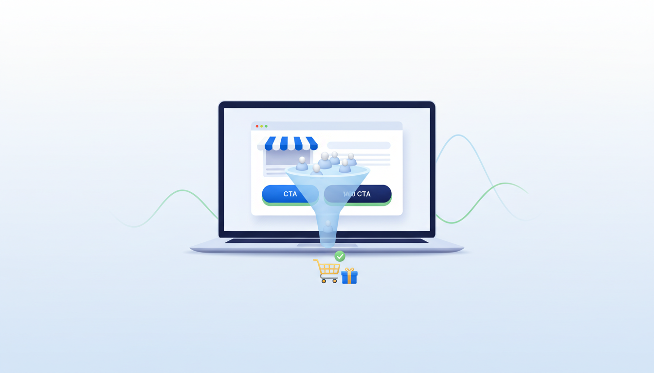
Your analytics show that people are visiting your website. You may even be paying for ads. But the contact inbox stays quiet, the shopping cart is abandoned, and revenue barely moves. That gap between attention and action is a conversion problem—and spending more on traffic before diagnosing it can increase losses.
Before redesigning everything, ask three questions: Are the right visitors arriving? Do they immediately understand the offer? Can they complete the next step without friction? The answers tell you where to investigate.
1. Your traffic may not include people ready to buy
Not all visits carry the same intent. Someone looking for a free tutorial is different from someone searching for emergency WordPress repair. Traffic from broad interest targeting can look impressive while producing few enquiries. Compare conversions by channel, landing page, search query, location and device instead of relying on total sessions.
An actionable test: write down the exact customer problem each landing page solves. Then compare it with the promise of the ad, post or search result that brought people there. If they don’t match, improve targeting or create a more relevant landing page.
2. The headline talks about your company, not the customer’s problem
A visitor should understand within seconds what you offer, who it helps and what to do next. “Innovative solutions for the digital future” sounds polished but doesn’t explain a service. “Fix your broken WordPress checkout” gives a relevant buyer a concrete reason to keep reading.
Lead with the outcome, add a plain-language supporting sentence, and make the primary call to action obvious. Test the page with someone unfamiliar with your business and ask them to summarize the offer after five seconds.
3. The next step is hidden, confusing or too demanding
A button marked “Learn more” may not fit a visitor who wants a quote. Make your main action specific: Get a Quote, See Pricing, Book a Consultation, Buy Now or Request Support. Keep the destination consistent with the button. On mobile, make sure the call to action isn’t lost below a long decorative section.
For a service form, initially request only the information needed to respond. Asking for a company registration number, large project brief and phone number before explaining the offer can discourage customers.
4. Visitors cannot see enough evidence to trust you
People naturally hesitate before giving payment details or contacting a business they don’t know. Show clear contact information, relevant examples of work, support expectations, service boundaries and realistic delivery details. Use genuine reviews only when you have them; invented testimonials or fabricated project results damage trust.
For digital downloads, explain licensing, compatibility, update policies and any requirements before checkout. Buyers should know exactly what is included.
5. The price or total cost is unclear
Unexpected fees and vague “contact us for everything” pricing can stall decisions. Where feasible, provide a starting price, package scope, example deliverables or an explanation of how quotes work. For ecommerce, make taxes, shipping, subscription terms and final totals understandable before Place order.
6. Mobile visitors face a different experience
A desktop homepage can look excellent while small-screen visitors struggle with menus, misaligned buttons, tiny form fields or horizontal scrolling. Review the entire purchasing or enquiry path on an actual phone and a slower mobile connection. Pay special attention to pop-ups and sticky chat widgets that cover essential controls.
7. Page speed interrupts interest before it becomes action
If the hero takes too long to appear or buttons freeze, visitors can abandon the page before judging the offer. Compare PageSpeed Insights data and real-user Core Web Vitals, then focus on oversized images, heavy scripts, unnecessary plugins and caching errors. Our WordPress speed checklist explains where to begin.
8. The checkout or enquiry form is quietly broken
Conversion rates sometimes collapse because the system isn’t working: a payment gateway only supports certain currencies, a contact form has failed email delivery, or a required field can’t be filled on mobile. Submit test enquiries and place test orders on a recurring schedule. Test as a new visitor, not only as an administrator.
If your store has payment failures, see our guide to WooCommerce checkout troubleshooting.
9. Your page tries to sell too many different things at once
A single landing page with six unrelated service offers, multiple competing buttons and a long list of features can make the next step feel uncertain. Group services logically, make a primary offer prominent, and use secondary links for visitors who need alternatives. A homepage can introduce the business broadly; targeted landing pages should answer one customer intent especially well.
10. You are measuring visits, not the journey
Sessions and pageviews alone cannot tell you where prospective buyers stop. Set up appropriately consented analytics events for meaningful steps: landing-page view, product view, add to cart, begin checkout, purchase or enquiry submission. In Google Analytics 4, compare these steps in a funnel exploration. Avoid recording passwords, card details or unnecessary personal information in events.
For service websites, distinguish “clicked a phone link” from “completed a verified enquiry.” A click is useful evidence, but it is not automatically a qualified lead.
A simple diagnosis you can run this week
- Day 1: Select one important offer and define a real conversion (sale or completed enquiry).
- Day 2: Check traffic quality by channel, device and location; inspect whether the landing page matches the original promise.
- Day 3: Test the entire customer journey on mobile and desktop, including submission or payment confirmation.
- Day 4: Clarify the headline, offer and primary call to action; remove one unnecessary form field if possible.
- Days 5–7: Compare meaningful funnel events and customer feedback. Do not declare a winner from a tiny sample.
What improvement should come first?
Prioritize by the stage with the largest confirmed loss. If only a small share of ad clicks become actual landing-page visits, investigate page load, tracking and link destination. If visitors reach checkout but orders fail, fix the technical problem before changing ad creative. If plenty reach the quote form but few complete it, review trust, clarity and form friction.
Frequently asked questions
Will buying more traffic solve a low conversion rate? Not by itself. Better targeting can help, but technical failures and confusing offers will waste additional traffic.
What is a good conversion rate? It varies by industry, visitor intent and what counts as a conversion. Compare your own channels, landing pages and historical results before adopting a universal benchmark.
Do I need a full redesign? Often no. One clear headline, reliable form, fast mobile experience or improved checkout can matter more than a complete visual rebuild.
Build a site that turns interest into enquiries
DevTechi helps businesses improve WordPress websites, ecommerce stores and customer journeys. If you want a practical review of your current site, tell us about your project.